
Sunday, 25 March 2012
Mindmap Poster
Following the advice of one of the faculty members, I took the crazy mind-map that has been hanging in front of me in my studio for weeks now and turned into a typographic poster. I am exploring the dynamics of efficiency and inefficiency of process, the mechanical nature of much of contemporary graphic design, interruption, and the balance between practice, process and performance. It's still in progress, I'd love some opinions...

Wednesday, 14 December 2011
Fall 2011 Work
Yesterday, we had our finals. For the occasion, I made a book compiling my work and process for the semester. Click it to view full-screen (one page is still not showing on issuu... trying to get that worked out)
Friday, 2 December 2011
triNETy
I'm currently working on a series of three illuminated webpages on what I consider to be the digital Holy Trinity: Google, Facebook, and Youtube. These are the three most visited websites worldwide with millions and millions users that use visit these pages daily, almost religiously.
We go to religion to answer our questions, to show us how to live, and to connect with our fellow man/woman; these motivations seem quite similar to what compels us to visit these sites. Just as in the Holy Trinity, these three sites are the same but different; they each have their own purpose, but are all very much interconnected.
To create these borders, I allowed myself to only use the decorative elements present on each site's homepage. As techniques, I only used duplication, reflection, and rotation (by 90 degree increments only).
The issue for me now is giving a purpose for these borders that goes beyond the parallel drawn between religion and digital ritual. Initially, I was thinking about typesetting each site's mission statement in latin, but it seemed too simple. The content of these sites is often quite mundane, and there is something interesting about meticulously illuminating something like, "omg, I love your hair in this pic," but I also want to focus on the power of these institutions...
Any thoughts?
We go to religion to answer our questions, to show us how to live, and to connect with our fellow man/woman; these motivations seem quite similar to what compels us to visit these sites. Just as in the Holy Trinity, these three sites are the same but different; they each have their own purpose, but are all very much interconnected.
To create these borders, I allowed myself to only use the decorative elements present on each site's homepage. As techniques, I only used duplication, reflection, and rotation (by 90 degree increments only).
The issue for me now is giving a purpose for these borders that goes beyond the parallel drawn between religion and digital ritual. Initially, I was thinking about typesetting each site's mission statement in latin, but it seemed too simple. The content of these sites is often quite mundane, and there is something interesting about meticulously illuminating something like, "omg, I love your hair in this pic," but I also want to focus on the power of these institutions...
Any thoughts?
 |
| Youtube illuminated border |
 |
| Youtube illuminated border detail |
 |
| Facebook illuminated border detail |
 |
| Google illuminated border detail |
Saturday, 30 July 2011




Saturday, 23 July 2011
Too Ostentatious?
This is the same text set in another cut of the same typeface (Poetica) both inspired by Arrighi's script. This one obviously has a ton of ligatures, alternate glyphs, endings, swash capitals, etc. Is it too much? Too fancy? Thanks for your input. Below is the original I typeset yesterday (Centaur).


Brothers Grimm
Here is the first version I feel comfortable showing. You will have to trust that it is the last of many many experiments. Choosing the typography (the simple typography on top) was one of the more challenging parts. I looked at book cover archives from the 20s as well as the work of London-based designer David Pearson. I tried out about 20 different classic serifs in different weights and degrees of capitalization. I eventually settled on Centaur (designed by bruce rogers in the early 1900s--the italic was based on Arrighi's calligraphy... which i LOVE!!)
I'm targeting these books to an adult audience (the original Grimm fairytales are not without their share of violence, death, sex, and tragic endings), but I still want to communicate the whimsical, folkloristic nature of this type of narrative.
I've been looking at monograms a lot in the past few days and decided a kind of monogram might be the way to go to add a decorative element. The custom of monograms is typical of the time in which these books were first published and it allows me to add some dynamism to an otherwise very static (intentionally) layout.
Anyway, enough talk. As always, comments and opinions are very welcome.

I'm targeting these books to an adult audience (the original Grimm fairytales are not without their share of violence, death, sex, and tragic endings), but I still want to communicate the whimsical, folkloristic nature of this type of narrative.
I've been looking at monograms a lot in the past few days and decided a kind of monogram might be the way to go to add a decorative element. The custom of monograms is typical of the time in which these books were first published and it allows me to add some dynamism to an otherwise very static (intentionally) layout.
Anyway, enough talk. As always, comments and opinions are very welcome.

Friday, 22 July 2011
Quandary
I've been thinking about what books to make jackets for... I think it's very important to be familiar with the content of the book before attempting to design the cover, but there are very few authors who's books I've read three of. I think Jane Austen, David Sedaris, and J.K.Rowling might be the only ones. None of those really appealed to me. So I was thinking, may I bend the rules and do three books of fairytales:
- New Fairy Tales :: Hans Christian Anderson (the little mermaid, the snow queen, the ugly duckling, etc)
- Stories of Fairy Tales from Bygone Eras :: Charles Perrault (little red riding hood, puss in boots, bluebeard, etc)
- Children's and Household Tales :: Jacob & Wilhelm Grimm (cinderella, sleeping beauty, snow white, etc)
May I cheat and do that?
Tuesday, 19 July 2011
PSA Posters on Chronic Dehydration
My three finished PSA posters on the importance of staying hydrated. A little bit on the right is getting cut out of the column... you can click to enlarge / see the whole poster.


Sunday, 17 July 2011
Good ol' Dihydrogen Monoxide
Upon additional research, I've learned that the chronic dehydration problem in the US of A is further exacerbated by how overmedicated the American population is. We have a headache, we pop a painkiller; we feel sad, we take some Prozac; we get wrinkles, we inject some Botox... Though there is a certainly place and a need for medication (serious depression for example is more than just being a little sad, and requires meds), one cannot deny America is particularly pill happy.
That said, overmedication can make dehydration even more dangerous: when we are dehydrated, our body goes through a variety of crisis management processes that can manifest themselves as headaches, asthma, high blood pressure, weight gain, depression, mood swings, etc. These all happen for a reason, but by taking meds, we are tricking our bodies into not feeling the pain that would normally alert us that something is wrong. Therefore, we are getting more and more dehydrated.
Back to design: so, I'm going to package and advertise water as if it were a pharmaceutical product (using water's lesser known name: Dihydrogen Monoxide) and make a PSA campaign around that. At first, I wanted to use Helvetica, since it's so anonymous and utilitarian looking... but I'm so sick of seeing Helvetica, so I finally settled on DIN. I am having a passionate love affair with DIN in this period.
That said, overmedication can make dehydration even more dangerous: when we are dehydrated, our body goes through a variety of crisis management processes that can manifest themselves as headaches, asthma, high blood pressure, weight gain, depression, mood swings, etc. These all happen for a reason, but by taking meds, we are tricking our bodies into not feeling the pain that would normally alert us that something is wrong. Therefore, we are getting more and more dehydrated.
Back to design: so, I'm going to package and advertise water as if it were a pharmaceutical product (using water's lesser known name: Dihydrogen Monoxide) and make a PSA campaign around that. At first, I wanted to use Helvetica, since it's so anonymous and utilitarian looking... but I'm so sick of seeing Helvetica, so I finally settled on DIN. I am having a passionate love affair with DIN in this period.
 |
| the label, for example, would look something like this--oh, and the kerning was fixed since this version... it's pretty horrible here. |
Chopsticks Magazine Cover
I know this is not related to class, but I was just honored to win the Chopsticks NY magazine cover design competition; which means I will be joining two other designers as the cover artist for 2012. This is my proposal for the New Year's cover. Visually, it's inspired by the format of the postcards that are traditionally sent at the new year in Japan. I made a woodblock print (2 plates/colors) because it not only references a medium that was often used in traditional Japanese arts, but also reproducibility and seriality.
This cover is up against two others, both really beautiful; the magazine wants the internet to decide who gets the first cover of the year. If you want to go to the site and vote, click here, you don't have to vote for me (though I would definitely love to win). Sorry for the digression, back to school work now.
This cover is up against two others, both really beautiful; the magazine wants the internet to decide who gets the first cover of the year. If you want to go to the site and vote, click here, you don't have to vote for me (though I would definitely love to win). Sorry for the digression, back to school work now.
 |
| you can click to enlarge |
 |
| this is one of the two wood plates I made |
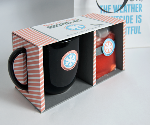
NY Winter Survival Kit
Here is the finished survival kit, made from three thrift shop items.
I love the typefaces I used, and they are both free: Lobster and Franchise Bold


I love the typefaces I used, and they are both free: Lobster and Franchise Bold


Saturday, 16 July 2011
Chronic Dehydration
So, between 75 and 80% of Americans are chronically dehydrated. We've all heard that we have to drink at least 8 glasses of water per day, but we we don't necessarily realize is that being dehydrated can cause or exacerbate a variety of conditions; including:
- Depression
- Constipation
- Asthma and Allergies
- Joint Pain
- Heartburn
- Hypertension
- Kidney damage
- Weight gain (with it's negative cholesterol effects)
- Premature aging
Drinking enough water (not soda, tea, or coffee, but plain water) is the single most important thing we can do to for our health.
This is what I want to do my PSA posters on. I finally found a topic... it certainly took long enough. Now, I have to find some sort of design direction/concept for the posters.
Monday, 11 July 2011
Packaging & Identity
I went to the two Goodwill stores and finally decided on these three items:

- a mug
- socks
- a set of two small hand warmers
It was a rainy day, so I guess I was in the mood for comfort and warmth.
I'm thinking of making a kit of some sort... something kind of funny to survive long New York City winters. Here are my glamorous three objects:

I stumbled upon the identity for a London-based supermarket designed by Unreal studio. http://identitydesigned.com/the-peoples-supermarket/ I love how simple, effective, and utilitarian the design is. delicious.
Wednesday, 29 June 2011
Bucket List Poster
Here is the poster I presented in class last night. I would have put it up sooner, but I was working on it till the very end.


Saturday, 25 June 2011
Five Year Bucket List
I've been thinking about this assignment and these are the main observations I've made:

- how to organize a decent amount of information on a big page
- how to reference plans, desires, directions, etc
- how to do something that's somewhat analytical, but also personal
The concept I would like to explore for this is maps. Maps organize a great deal of information and reference direction and roads. Antique maps, in particular have gorgeous typography illustrating what the map is about, who made it, why, etc... I think this could be an interesting metaphor for my bucket list poster.

Tuesday, 21 June 2011
Italian Referendum
This pattern is about the recent vote the Italian people had to abrogate 3 laws. This is a particularly important time for Italians... to be able to repeal a law, 50% of the voting population plus 1 have to vote. Italy is run by Berlusconi who announced he would not vote and urged other citizens to do the same (one of the laws up to be repealed allowed him to not be prosecuted for crimes while in office). For the first time since 1995 enough italians voted and enough voted against these 3 laws. Lots of the youth, aided by social networking sites, was informed (despite the clouding of the Berlusconi-owned media) and voted.
In my opinion, this is a great time for Italy, the population of what the EU considered the most politically corrupt country of the union is saying NO, we will not take this any longer.
Another thing that bears mentioning is that these referendums are generally blind to political inclinations... right wing and left wing alike voted against these laws

In my opinion, this is a great time for Italy, the population of what the EU considered the most politically corrupt country of the union is saying NO, we will not take this any longer.
Another thing that bears mentioning is that these referendums are generally blind to political inclinations... right wing and left wing alike voted against these laws

Subscribe to:
Posts (Atom)
